When we design a logo, you also get a short guide to using it: every version and where it goes, the space around it, the smallest sizes, the colors and fonts, and the do's and don'ts. Here is the guide for Promethean, an award-winning international live-streaming startup whose logo we designed.
A flame that becomes a play button, for a brand built on live video. The horizontal full-color logo is the main version. Use it wherever there is room.
123
1The markThe flame with the play button inside. It also works alone as the icon.
2The wordmarkPROMETHEAN in Kubra Bold, redrawn taller for the logo. Always use the logo file; never type the name in its place.
3The taglineIgniting Video Commerce, set in Lato Regular. It stays with the logo at larger sizes and can be left off when space is tight.
02 · Versions
Six versions, one for every place.
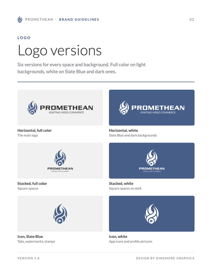
Pick the version that fits the space and the background. Horizontal for wide spaces, stacked for square ones, and the icon when space is tiny. Full color on light backgrounds, white on Slate Blue and dark ones.
Horizontal, full colorThe main logo. Website headers, letterhead, email signatures and signs with room to spare.
Horizontal, whiteOn Slate Blue, dark photos and video: sign panels, end cards and dark website sections.
Stacked, full colorSquarer spaces: business cards, flyers, shirts and social posts.
Stacked, whiteSquarer spaces on Slate Blue or dark backgrounds.
Icon, Slate BlueWhere the name already shows or space is tiny: browser tabs, watermarks, stamps.
Icon, whiteApp icons and social profile pictures, on a Slate Blue square or circle.
03 · Clear space and size
Room to breathe.
Keep other text and graphics out of the clear space, and never go below the smallest sizes. Clear space keeps the logo easy to spot; the smallest sizes keep the tagline and play button readable.
xxxx
Clear space = x on every side, where x is the height of the letters in PROMETHEAN. The same rule applies to the stacked logo and the icon.
Horizontal140 px wide on screens1.25 inches in print
Stacked72 px wide on screens0.75 inch in print
Icon16 px tall on screens0.25 inch in print
04 · Color
Two colors and white.
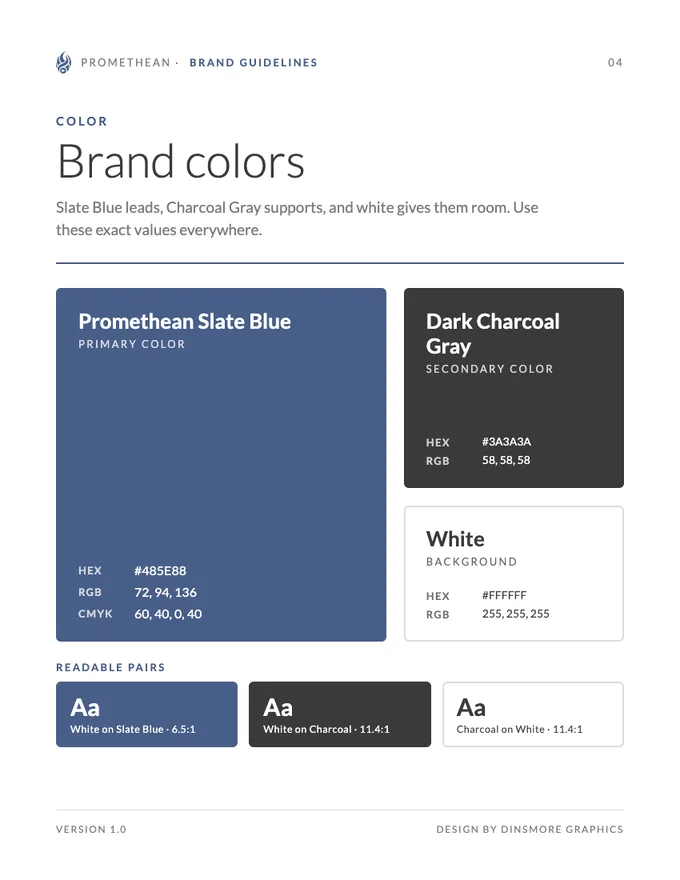
Slate Blue leads, Charcoal Gray supports, and white gives them room. Use these exact values everywhere: HEX and RGB for screens, CMYK for print.
Promethean Slate BluePrimary color
HEX
#485E88
RGB
72, 94, 136
CMYK
60, 40, 0, 40
White on Slate Blue6.5:1 · AA
Dark Charcoal GraySecondary color
HEX
#3A3A3A
RGB
58, 58, 58
CMYK
69, 62, 61, 52
White on Charcoal11.4:1 · AAA
WhiteBackground
HEX
#FFFFFF
RGB
255, 255, 255
CMYK
0, 0, 0, 0
Charcoal on White11.4:1 · AAA
05 · Typography
Fonts that match the logo.
The wordmark is Kubra Bold; the tagline and everything else is Lato. Lato is free from Google Fonts, so it works on the website, in documents and in print.
Wordmark typeface
Kubra Bold
The PROMETHEAN wordmark is set in Kubra Bold, then redrawn taller for the logo, so the logo files are the only true version. Use them for the name; don't retype it, even in Kubra.
Used for
The wordmark only
Weight
Bold
Brand typeface
Aa
Lato LightLato RegularLato Bold
Lato
The tagline is set in Lato Regular. Use Lato for headlines and body text too, on screen and in print.
Used for
Tagline, headlines, body text
Weights
Light, Regular, Bold
Get it
Free from Google Fonts
Igniting video commerce
A headline set in Lato Bold
Headlines in Lato Bold, labels in Lato Regular with wide letter spacing, and body text in Lato Regular.
06 · Usage
Do's and don'ts.
Use the files as they are, on backgrounds where they stand out. Most logo mistakes come from stretching, recoloring or crowding it.
Do
Full color on white or light gray
White on Promethean Slate Blue
White on a dark photo or video
Don't
Don’t stretch or squeeze it
Don’t change its colors
Don’t rotate or tilt it
Don’t add shadows, glows or outlines
Don’t use full color on Slate Blue
Grand opening sale!
Don’t crowd it with other text
07 · In use
The guide, on a business card.
Every rule in this guide, on one small card. The contact side and the back follow the versions, colors and type above, so the card matches the website, the signs and everything else.
Contact side
Stacked full-color logo, with clear space all around
A Slate Blue band with white line icons
Dark Charcoal Gray type on white
The icon as a faint watermark behind the details
Back
Stacked white logo on Promethean Slate Blue
Tints of Slate Blue as a quiet accent strip
Included with every logo
Want a guide like this for your logo?
Every logo project ends with your logo in every version, in PDF, PNG, JPEG, SVG and WebP formats, plus brand guidelines like these, yours to keep.